How the data is presented in the dashboards
Once the data is collected in 2 different ways – through API and through user simulation, it shall be presented in an understandable way.
The dashboards designed for the CrossOver project are meant to be publicly available and free to use. For the purpose of the project, the data displayed in the dashboards is used by Apache for investigation purposes. Savoir*Devenir will produce media and information literacy content based on the datasets.
The dashboards are supposed to be understandable by anyone. They enable the user to see all the important data instantly.
The user has the possibility to narrow its research by filtering data. For example, one can select a date (starting on 1st of February 2022), a time of the day (AM, PM or the entire day, corresponding to the data collection period), a platform (Google suggest, Twitter trends, Reddit hot posts, Youtube search and suggest, Facebook post or Google news), and a language (French or Dutch). As a reminder, the data is collected from Belgium according to the scope of the project. The goal is to display data in the most understandable way, permitting accurate qualitative and comparative analysis of the publications, photos, links, videos or other recommendations by service providers.
Google suggest
The dashboard for Google Suggestions displays Google search autocomplete suggestions as if a user would type a search term or expression in the search bar on google.be. For a specific search term, the dashboard shows the related suggestions and the top domains over the suggestions, that is to say domains suggested at least twice in the search results of the search suggestions.
Data collection occurs twice a day, using automation running on Raspberry Pis, as Google does not provide an API to collect autocomplete suggestions or search results, in both Dutch and French.
For Twitter, the dashboards display all the trending topics during the last hour in Belgium. The data collection, however, doesn’t take into account the language: only trending topics in Belgium, whether they are in Dutch, French, English, or any other language, are monitored. Data collection is performed both through API calls and Raspberry Pi automation.
The dashboard also shows whether a tweet is promoted or not, the number of tweets during the past hour mentioning to the trending topic, as well as the evolution of its rank since the last data collection..
The data displayed in the dashboard for Reddit shows the results of the monitoring of multiple subreddits (/r/, a forum dedicated to a specific topic) and allows users to see which threads are the hottest -i.e. the most interacted upon over the last 12 hours.
The two subreddits monitored are /r/ Belgium and /r/ Antwerpen. Similarly to Twitter, the language parameter is not taken into account.
The data is collected twice a day and permits to monitor how the topics are evolving on a dedicated subreddit.
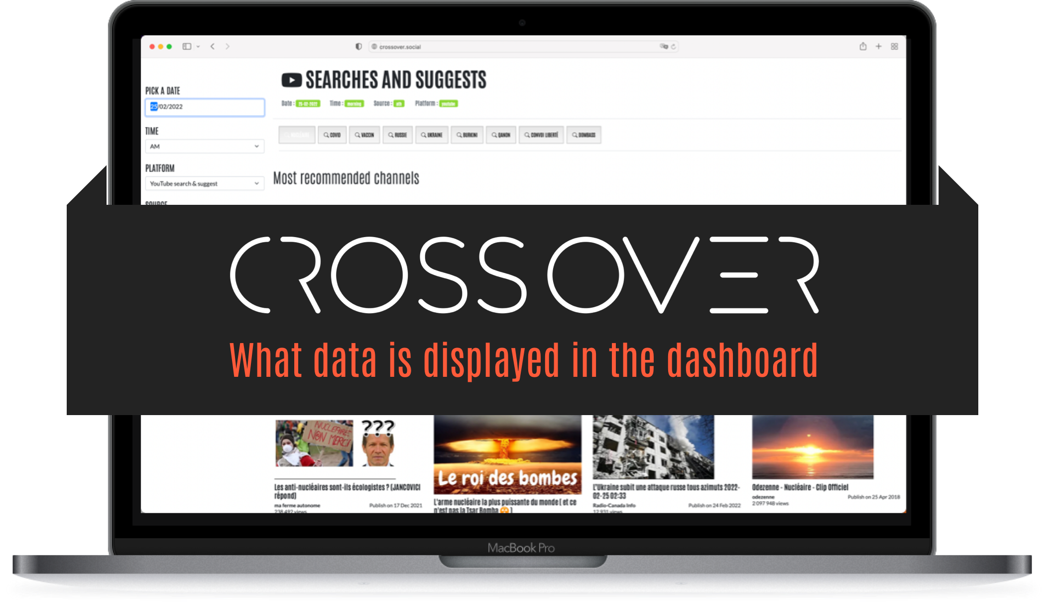
Youtube
The Youtube dashboard displays the results of a query with a keyword (those keywords are displayed under the date-time-source and platform). The dashboard simulates a user that would search for a keyword. It shows the most recommended channels in the result page and the top 24 research results associated to this keyword. Then, the system simulates a user clicking on one of the above-mentioned video appearing in the results, the dashboard displays the recommended channels in the associated videos and the top 24 most recommended videos – in the autoplay queue displayed on the results page..
The Facebook dashboard displays results of a query with specific terms (those terms are displayed under the date-time-source and platform). It monitors the 25 posts most interacted upon over the past hour, using specific terms. For each term, the result is split between content originating from public groups and content published on public pages. This content is filtered in French or Dutch. The top account category shows the recurrence of a keyword in a group or public page over the last hour of monitoring.
Google News
The Google News dashboard is a collection of the 100 first news results after keyword search, filtered by country and language. The graphs and associated names show the recurrence of a website in the results of a search for a keyword.
For which purposes can the data be used ?
The possibilities of data analysis are endless. The goal of the dashboards is to allow analysis of algorithmically suggested content on the platform, in order to understand the role of the algorithm in the spread of disinformation. As the CrossOver project aims at adopting a cross-platform approach, the dashboards lets users choose if they wish to perform a granular analysis or paint the big picture in broad strokes.
Constant monitoring enables the observation of the evolution of a specific topic in time, counting in days, weeks or months. Furthermore, the two methods of data collection enable analysis of the differences between the obtained data through APIs and through user emulation.
If you read the previous blogposts (What data is collected and What methods are used for data collection) , you will understand that the dashboards are the display of collected data, and they are meant to retrace the path which led the user to be confronted with disinformation.
Discover more

CrossOver: Assessing the role of content recommendation in the spread of disinformation
Crossover is a European project to monitor, analyse and combat algorithmic disinformation.
Odysee monitoring and more data visualisation: the new dashboards are out
In February, we released the first version of the dashboards for the CrossOver project. This second version enhances the first one, and adds a new platform monitored: Odysee
CrossOver now also monitors Mastodon
As hundreds of thousands of Twitter users are leaving the service after Elon Musk bought it, the CrossOver team decided to add another platform to its monitoring: Mastodon.

See what algorithms recommend to Finns on Tiktok, YouTube and other platforms: CrossOver Finland dashboards are now live
Check First and the Finnish fact-checking organisation Faktabaari have developed a methodology that allows anyone to look under the hood of social media recommendation algorithms.